Charts - Misc charts: Difference between revisions
| (3 intermediate revisions by the same user not shown) | |||
| Line 32: | Line 32: | ||
== Thermal Seasons == |
== Thermal Seasons == |
||
[[File:Thermal Seasons.jpg|thumb|right|Thermal Seasons]] |
[[File:Thermal Seasons.jpg|thumb|right|Thermal Seasons]] |
||
<small>'''NOTE:''' This chart will only produce when a year starts on the first of january (Northern hemisphere) or first of July (Southern hemisphere) So if you start your station on 22 August 2022, this chart won't show 2022 (i.e. ist is blank) but the first sesasons chart will show on 1 January 2023). You can hide it by setting the relevant parameter to false) |
|||
| ⚫ | A variation on the [https://jussilanet.com/chartstermiset.htm Thermal Seasons] chart by [https://cumulus.hosiene.co.uk/memberlist.php?mode=viewprofile&u=16853 @Pes]. This interesting chart, together with the Temperature Sum and the Growing Degree Days it forms the set of Agriculture related charts, displays the proportional contribution of the seasons in the year where the boundaries between the seasons is simply defined by temperature |
||
</small> |
|||
| ⚫ | A variation on the [https://jussilanet.com/chartstermiset.htm Thermal Seasons] chart by [https://cumulus.hosiene.co.uk/memberlist.php?mode=viewprofile&u=16853 @Pes]. This interesting chart, together with the Temperature Sum and the Growing Degree Days it forms the set of Agriculture related charts, displays the proportional contribution of the seasons in the year where the boundaries between the seasons is simply defined by average temperature of the day. |
||
This graph will be more important in the Nordic region where the growing season is short and requires careful planning. While The plant breeders are forcing the plants northbound, the farmers need to make it work. This type of charts helps. |
|||
And on the other hand: the temperature limits of the seasons thermal season vary with latitude: where Finland lets the spring start at 0 °C, in the Netherlands it is more 5 °C simply because otherwise there would not be a winter at all (which would not be correct because plants and animals are in rest). The temperature must be '''higher/lower than the limit for 10 days at least''' before the season changes. |
And on the other hand: the temperature limits of the seasons thermal season vary with latitude: where Finland lets the spring start at 0 °C, in the Netherlands it is more 5 °C simply because otherwise there would not be a winter at all (which would not be correct because plants and animals are in rest). The temperature must be '''higher/lower than the limit for 10 days at least''' before the season changes. |
||
This chart is also an heuristic and the limits can be defined by the user with the inifile parameters ''WinterToSpringTemperatureLimit'' and ''SpringToSummerTemperatureLimit'' which hold defaults of 0 °C and 10 °C (based on Finland). If the user uses Fahrenheit, just give the equivalent values of the limits in Fahrenheit. |
This chart is also an heuristic and the limits can be defined by the user with the inifile parameters ''WinterToSpringTemperatureLimit'' and ''SpringToSummerTemperatureLimit'' which hold defaults of 0 °C and 10 °C (based on Finland). If the user uses Fahrenheit, just give the equivalent values of the limits in Fahrenheit. |
||
As an indication for the limits the following is suggested (on the southern hemisphere use absolute value of latitude): |
|||
#Latitude > 55° => use limits of 0° and 10° Celsius for '''the average day temperature'''. |
|||
#Latitude between 45° and 55° => use limits of 5° and 15° Celsius |
|||
#Latitude between 35° and 45° => use limits of 10° and 20° Celsius |
|||
#Latitude < 35° => This chart most likely has no value, if it does, please notify). |
|||
== Daily EVT (Evapotranspiration) == |
== Daily EVT (Evapotranspiration) == |
||
| Line 52: | Line 63: | ||
At least two times there was a discussion on the forum about the way the daily average for temperature was or should be calculated (see [https://cumulus.hosiene.co.uk/viewtopic.php?p=138513#p138513 here] and [https://cumulus.hosiene.co.uk/viewtopic.php?p=152909#p152909 here]). CumulusMX uses an ''integration method'' which means it samples the temperature continuously at the sampling frequency and stores the average of those samples at the logging frequency. It creates the sum of the logged entries and at the end of day it divides them by the number of observations giving the arithmetic average of all values logged which acts as an estimator of the physical average. |
At least two times there was a discussion on the forum about the way the daily average for temperature was or should be calculated (see [https://cumulus.hosiene.co.uk/viewtopic.php?p=138513#p138513 here] and [https://cumulus.hosiene.co.uk/viewtopic.php?p=152909#p152909 here]). CumulusMX uses an ''integration method'' which means it samples the temperature continuously at the sampling frequency and stores the average of those samples at the logging frequency. It creates the sum of the logged entries and at the end of day it divides them by the number of observations giving the arithmetic average of all values logged which acts as an estimator of the physical average. |
||
<math>(Max+Min)/2</math> is used with the argument |
<math>(Max+Min)/2</math> is used with the argument that comparison with observations from before the computer era must be made. Note that the KNMI (the Dutch Meteorological Service) takes hourly measurements so there is no consistency between countries to start with. |
||
As an argument in this discussion this chart was made to make the difference between the institutional method and the Cumulus Integral Method visible. What is shown is the Cumulus Method Daily Average Temperature (one minute sampling): <math>(\sum_{minute=1}^{1440} {(Temp\ measurement)) \div 1440}</math>, the <math>(Max+Min)/2</math> and the difference between the two. It is clear that the first is the more accurate estimator of the two sample estimators (note they both are estimators for the statistic <math>average temperature of the day</math>). |
As an argument in this discussion this chart was made to make the difference between the institutional method and the Cumulus Integral Method visible. What is shown is the Cumulus Method Daily Average Temperature (one minute sampling): <math>(\sum_{minute=1}^{1440} {(Temp\ measurement)) \div 1440}</math>, the <math>(Max+Min)/2</math> and the difference between the two. It is clear that the first is the more accurate estimator of the two sample estimators (note they both are estimators for the statistic <math>average temperature of the day</math>). |
||
The difference has a pretty even distributed noise around the zero line so comparison of current ''integral'' with observations from the past (for climatic studies) should be possible with statistical proof and a consolidation of past and current measurements has actually been executed by the KNMI <ref>[https://cdn.knmi.nl/system/data_center_publications/files/000/068/325/original/CNT.pdf?1495621137 The Construction of a Central Netherlands Temperature]</ref>. |
The difference has a pretty even distributed noise around the zero line so comparison of current ''integral'' with observations from the past (for climatic studies) should be possible with statistical proof and a consolidation of past and current measurements has actually been executed by the KNMI <ref>[https://cdn.knmi.nl/system/data_center_publications/files/000/068/325/original/CNT.pdf?1495621137 The Construction of a Central Netherlands Temperature]</ref>. |
||
Another interesting article on the subject is below. <ref>[https://rmets.onlinelibrary.wiley.com/doi/full/10.1002/joc.6528 Sampling frequency of climate data for the determination of daily temperature and daily temperature extrema]</ref> |
|||
<references/> |
<references/> |
||
Latest revision as of 09:04, 10 February 2024
Introduction
The Miscellaneous charts seems to be converging to an agricultural chart section where four of five charts are relevant for estimating the timing of crop handling such as seeding or artificial rain. The submodule consists of five charts:
- Temperature Sum - A chart displaying the total sum of the daily average temperature for the year.
- Growing Degree Days - A chart - a variation on heating degree days - showing the growing season start and end
- Seasons - A chart showing the thermal seasons per year
- Daily EVT - An estimation of the Daily Evapotranspiration with a moving average
- Monthly EVT - Much like the similar graphs for rain and temperature, showing the evapotranspiration per month for each year
- Clash of Averages - See description below
You will find an example image of each chart and an explanation (of the calculation and the origin of the numbers)
For the calculations the standard C# LINQ-functions Min, Max and Avg are used. For the standard deviation this LINQ-extension is used with a modification for a minimum number of observations required of 2, if less the StdDev returns 0 (zero).
Temperature Sum
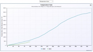
This is a chart displaying a curve for every year with data from the first of January. So an incomplete first year of your series will not be displayed as data starting halfway a year have no meaning. This chart obeys the parameter MaxNrOfSeriesVisibileInGraph. The unit for the temperature sum is degree days.
The graph represents the equation for every .
Growing Degree Days
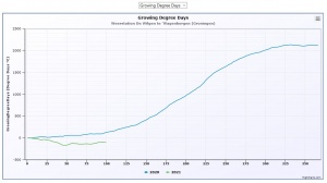
This is a chart displaying a curve for every year with data from the first of January. So an incomplete first year of your series will not be displayed as data starting halfway a year have no meaning. This chart obeys the parameter MaxNrOfSeriesVisibileInGraph. The unit for the temperature sum is degree days.
There is a parameter GrowingDegreeDaysReferenceTemp which represents the temperature at which plants start growing after winter rest. Then the graph represents the equation .
The reference temperature has a default of 5 °C which has it's origin in Finland and Sweden. You may adjust it to your own climatological and vegetal local situation. See also this wiki page. Note that this chart does not use a cut off at 30 °C because of the way the average is calculated.
See also the paragraph below on Clash of Averages and beware of the difference between a definition of an integral and an estimator for an average to use for calculation.
Thermal Seasons
NOTE: This chart will only produce when a year starts on the first of january (Northern hemisphere) or first of July (Southern hemisphere) So if you start your station on 22 August 2022, this chart won't show 2022 (i.e. ist is blank) but the first sesasons chart will show on 1 January 2023). You can hide it by setting the relevant parameter to false)
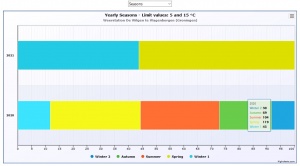
A variation on the Thermal Seasons chart by @Pes. This interesting chart, together with the Temperature Sum and the Growing Degree Days it forms the set of Agriculture related charts, displays the proportional contribution of the seasons in the year where the boundaries between the seasons is simply defined by average temperature of the day.
This graph will be more important in the Nordic region where the growing season is short and requires careful planning. While The plant breeders are forcing the plants northbound, the farmers need to make it work. This type of charts helps.
And on the other hand: the temperature limits of the seasons thermal season vary with latitude: where Finland lets the spring start at 0 °C, in the Netherlands it is more 5 °C simply because otherwise there would not be a winter at all (which would not be correct because plants and animals are in rest). The temperature must be higher/lower than the limit for 10 days at least before the season changes.
This chart is also an heuristic and the limits can be defined by the user with the inifile parameters WinterToSpringTemperatureLimit and SpringToSummerTemperatureLimit which hold defaults of 0 °C and 10 °C (based on Finland). If the user uses Fahrenheit, just give the equivalent values of the limits in Fahrenheit.
As an indication for the limits the following is suggested (on the southern hemisphere use absolute value of latitude):
- Latitude > 55° => use limits of 0° and 10° Celsius for the average day temperature.
- Latitude between 45° and 55° => use limits of 5° and 15° Celsius
- Latitude between 35° and 45° => use limits of 10° and 20° Celsius
- Latitude < 35° => This chart most likely has no value, if it does, please notify).
Daily EVT (Evapotranspiration)
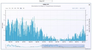
This chart only is valid when your weather station supports evapotranspiration. Currently that is only with the Davis stations with a solar sensor (optional). The calculation of the evapotranspiration is done by the station hourly (described here - pdf) and the daily sum is reported by CumulusMX in the Dayfile (field 24). This field is reported in this chart as a column chart. It also shows a moving average with a period as defined in PeriodMovingAverage.
The science around evapotranspiration is not only about weather variables, it is also much about the vegetation and the way plants use water. That may be very different in different climate zones as some plants are able to retain water by closing their stomata. Also forests have very different evaporation characteristics compared to open or half open fields. So in general, take care with this chart as it definitely has no absolute meaning nor heuristic that goes with it. It does however give a general view of the water condition and could be used as an heuristic itself to determine start of artificial raining (water gift)
Monthly EVT (Evapotranspiration
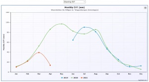
This chart shows the evapotranspiration - see previous chart for explanation - per month for every year. The years have a different colour according to the colour scheme. The number of series directly visible is governed by the parameter MaxNrOfSeriesVisibleInGraphs.
Clash of Averages
At least two times there was a discussion on the forum about the way the daily average for temperature was or should be calculated (see here and here). CumulusMX uses an integration method which means it samples the temperature continuously at the sampling frequency and stores the average of those samples at the logging frequency. It creates the sum of the logged entries and at the end of day it divides them by the number of observations giving the arithmetic average of all values logged which acts as an estimator of the physical average.
is used with the argument that comparison with observations from before the computer era must be made. Note that the KNMI (the Dutch Meteorological Service) takes hourly measurements so there is no consistency between countries to start with.
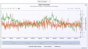
As an argument in this discussion this chart was made to make the difference between the institutional method and the Cumulus Integral Method visible. What is shown is the Cumulus Method Daily Average Temperature (one minute sampling): , the and the difference between the two. It is clear that the first is the more accurate estimator of the two sample estimators (note they both are estimators for the statistic ).
The difference has a pretty even distributed noise around the zero line so comparison of current integral with observations from the past (for climatic studies) should be possible with statistical proof and a consolidation of past and current measurements has actually been executed by the KNMI [1].
Another interesting article on the subject is below. [2]

![{\displaystyle [(Average\ Temperature)>0]}](https://en.wikipedia.org/api/rest_v1/media/math/render/svg/ad4e3d46c3fdf175dd846f86168a34ac0e22408b)
